Posts

infinite-reach-rebranding-blank-pages

New Beginnings: Your Guide to Rebranding

No matter how long your business has been in the game, it’s important to keep apace of the changing market. Target audiences may be shifting, expanding, or contracting faster than ever before and it’s all you can do to keep up with them. Sometimes this is easy, but sometimes it requires a radical shift on the part of your business. With the new year approaching, it’s time to take a look at one high risk (but potentially very high reward) moves: rebranding.


What Does it Mean?

Rebranding can be done many different ways, but the ultimate goal is the same: to create a new identity for your brand. We’ll talk about some of the strategies for this later, but the first step to successfully rebranding is to identify what your current brand is.

You can do this by looking at your brand elements. This includes everything about your brand from the name down to the logos and catchphrases. We’ve laid out everything you need to know about brand elements here. Rebranding means that some or all of these elements are going to change.


Why Rebrand?

If your business is steadily growing, reaching new audiences and turning them successfully into customers, a rebrand may not be right for you. Rebranding works best when there are opportunities for you to seize that no other strategy will reach.

Perhaps your original target audience was too narrow, and a rebrand will broaden your appeal. Perhaps as you move into larger markets, competition is stronger and you need to evolve stand out more. Or perhaps feedback from customers shows that some of your brand elements are confusing, BLANK, or downright boring.


Rebranding Dos and Don’ts

If you’ve decided a rebrand is the best option for your company, there are a few things to keep in mind as you move forward. Rebranding is a risky move—you want to proceed carefully and make sure you analyze every decision.

DO:

  1. Keep what worked from your old brand; a new logo might be in order, but you don’t always have to change your brand’s name, or vice versa.
  2. Try and be consistent. We’ve discussed how crucial brand consistency is before, and you don’t want to lose any loyal customers as you rebrand.
  3. Give your audience something to talk about. A new slogan to try out, a new story to experience—anything that gets them thinking and talking about your brand.


DON’T:

  1. Alienate your current audience. Focusing on new audiences is great, but remember who supported your brand first. Brand loyalty works both ways.
  2. Toss out your entire brand. Starting fresh may sound like the right idea, but with an original brand identity you carefully crafted, there are many elements you can and should recycle. Maybe a new logo, but consider using the same colors, fonts, etc. This will also bridge the gap between your old brand and your new one in the audience’s minds.
  3. Just change one element. Remember in 2009 when RadioShack became “The Shack” but didn’t change anything else about their brand? Yeah, neither do we, because it was a really bad move and they’ve since changed their name back. We found that gem in this article from entrepreneur.com—they have tons more golden rules of rebranding backed with real-world examples.


Your brand is a reflection of your business’s heart and soul. Changing it may be necessary to keep up with the rapid shifts in today’s markets, but remember that your company’s appeal will always come from the core of ideas and strategies that you first dreamed up. If you’re considering an extreme makeover, business edition, get in touch with us today to talk about how to make your brand stronger in 2017. And from all of us at Infinite Reach, Happy New Year!

How to Tell Your Company’s Origin Story, and Why

People love a good story, and especially a good origin story. It’s a form that has persisted in many cultures for centuries, from the Book of Genesis right up to the latest film to reboot a superhero franchise. The popularity of this form is something you—and your business—can harness in several ways to help both you and your clients.

Why You Should Tell Your Story

Every company has one: a spark, a handshake, a moment when the idea became a reality. Some, like the building of the first Apple computer in Steve Wozniak’s garage, or Facebook’s Mark Zuckerberg hacking the Harvard network, are well documented, even in feature films. Others—like these 10 outlined by Forbes—might be stranger than you think. The appeal of the origin story has even prompted some companies to fabricate an interesting anecdote as a PR strategy. We don’t recommend this course, obviously, but it just goes to show the power of a well-told narrative.

Your company origin story:

  • Highlights some if your company’s unique traits
  • Lends a personal touch to your webpage and other content
  • Conveys your company values and how they’ve evolved from your history
  • Is a key part of your brand guideline, as we’ve written about in this post
  • Helps you stand out from competitors
  • Entertains as well as informs
  • Provides a break from other, the more sales-focused content, AND
  • Gives the readers, your potential clients, a chance to get to know your business and insert themselves into your story


How to Tell Your Story

We’ve established that telling your origin story is vital for your company, but telling it well is just as important. A poorly told story could confuse readers or convey the wrong messages about your business, both things you want to avoid when attracting customers! These tips will give you some guidelines when adding this vital aspect to your brand.

Keep it Simple

As Lewis Carroll wrote, “Begin at the beginning, and go on till you come to the end: then stop.” Nobody wants to read a complex tale that involves extraneous details, overlong explanations or lots of jumping around. Only include the aspects relevant to your business. If you run an Italian restaurant based on the cooking your great-grandparents brought to America, some background on them is great, but a whole family tree might be unnecessary. If you founded a tech startup, your early days tinkering in the garage can be interesting, but a full list of your science fair projects is too much.

Make it Stand Out

Something you may not have considered is keeping your origin story in its own special place on your website. This can mean a subsection of your “About” page, or front and center if the page is all-in-one. You’ll notice that at Infinite Reach, we keep our “About Us” separate from our “Services” page, in order to highlight the difference. Readers want to know what you do, but they also want to know who you are. Keeping your origin story distinct from the description of your business ensures this invaluable part of your company identity isn’t lost on potential clients.infinite-reach-company-origin-story-about-us

Cover the Basics

In this article, tech.co outlines a few questions to ask yourself when considering your story and how to tell it. They include: Who are you? Why did you start this business? And, How do you do [what you do] differently than others? These questions form a helpful guide that will ensure readers of your story will get the full picture of your company’s background and unique traits.

Speaking of Pictures, Use Them!

More and more, integrating visual aspects to any marketing strategy is becoming essential, and the origin story is no different. The images are a great way to show the human face of your business, especially its humble beginnings. Share a photo of the ribbon-cutting at your first location, the prototype of your first product, or the employee’s dog that became your unofficial mascot. The personal aspect and values of your company will come across in these images.

Better yet, try video! A short clip of your company’s founders discussing how their passion grew into the current business is a dynamic way to get the story across. In this article, Steve Jurveston (the venture capitalist behind Hotmail and Tesla Motors, among others) says he always films early meetings with company founders when considering investments, knowing the value of someone’s vision as told in their own words.

Keep it Going

Your story is never finished—it’s constantly evolving. Update the page with any progress you’ve made, use recent images to show how you’ve grown from the beginning, and emphasize a look toward the future. Your story is a great way to invite potential clients and customers to join you in the next chapter.


infinite-reach-personal-brand-attire-suit

Does Your Personal Brand Include Workplace Attire?

With office dress codes becoming a thing of the past, wardrobe choices are more important than ever in showcasing your personal brand at work.

What You Wear to Work Matters

A personal brand is a microcosm of your company’s brand, just as you—a front-facing worker or owner—can be the face of the company itself. In that light, most people know it’s crucial to make a good first impression. Avoiding messy, wrinkled, or mismatched outfits is a given, but does that mean you need to wear a freshly pressed three-piece suit every day?

The short answer is: no. But of course, it depends on many factors.

For one thing, there’s your chosen industry. If you sell high-end menswear or work high up on the corporate ladder, a full three-piece suit might be the appropriate choice—if you offer landscaping services, sell your own paintings, or run a bakery, not so much.

“Even jeans and a t-shirt can have a purpose, if that’s accepted clothing in your line of work,” says Jim Joseph for entrepreneur.com in this article.

infinite-reach-personal-brand-attire-sweater

Location is another element to consider. Here in Phoenix, summer temperatures can make suiting up impractical at times. Foregoing a jacket or wearing a polo in place of a button-up is considered more acceptable in the desert than a city like New York.

And of course, we all have that friend or colleague with a signature line of Hawaiian shirts.

So Maybe I Can Ditch the Formal Wear—What Next?

While in many places it seems the days of stringent workplace dress codes are on the way out, the freedom to make every day Casual Friday doesn’t mean standards should go out the window when it comes to attire.

“No matter your occupation or personality, you should have your own personal ‘dress code,’” says Joseph.

The key is brand consistency. We have a great blog on “Why Brand Consistency is Important”, and the lessons there can easily apply to your personal brand as well.

Sticking to your self-imposed “dress code” every day can:

  • Become an extension of your larger brand
  • Define your style
  • Communicate your company values
  • Help you find a target audience of like-minded clients
  • Get you in the mindset for work—like a uniform or suit of armor
  • Signal what is acceptable to your employees (if you’re the boss)
  • Show you’re ready to step into other roles (if you’re not the boss, yet)
  • Give others a sense of reliability

The goals are brand recognition and brand loyalty. Setting expectations for appearance and then meeting them with consistent wardrobe choices is a great way to achieve these goals and avoid mixed messages.

Beware of Boring

Though consistency is a decisive factor in personal branding, you must also be wary of sameness. There’s something to be said for owning identical button-up shirts in every color, but a good personal brand goes beyond the basics for a distinct look. You want to use your wardrobe to communicate what makes you—and by proxy, your company—unique.

Consider Hillary Clinton: politics aside, many have commented on her choice of the iconic pantsuit. It is recognizable, it is versatile, and it is a garment she has turned into a statement of identity. Even Clinton herself has joked about her favored attire: her Twitter bio lists “pantsuit aficionado” among her credentials.

She has leveraged the pantsuit into a reflection of her personal brand. The pantsuit is Hillary Clinton, and vice versa. It’s a shrewd branding strategy, and one that may pay off as she appears consistently to vie for the top job in the country.

For others, a personal brand can come down to well-chosen accessories. Examples can include flashy jewelry to class up an outfit, funky socks for a bit of fun, or colorful infinite-reach-personal-brand-attire-sockshandbags to signal youth and vivacity. The idea is to be noticed by standing out consistently. Remember our friend with the Hawaiian shirts? He knows the power of his personal brand, and how to dress for his own success.

At Infinite Reach, we know the power of branding, too. We take your brand identity into account in everything from web design to corporate photography—where the right outfit is essential! Check out our full range of services or contact us for a free consultation.

In the meantime, read our blog about “What Branding Colors Communicate to Your Clients” and start shopping for the right shades to suit your business today!

What Your Branding Colors Communicate to Your Clients

When choosing a color for your branding, it’s important to think carefully. Colors bring along different meanings and feelings to your clients, and it can mean the difference between clients choosing you for their projects or going with your competition.

It seems like a strange consideration. Could color really have that much of an impact?

Facts about the Psychology of Color:

  • 84.7% of consumers cite color as the primary reason they buy a particular product.
  • 80% think that color increases brand recognition
  • Ads created in color are read up to 42% more often than the same ads in black and white.

It Communicates Feelings

It’s no secret that colors are linked to different feelings and emotions. For example, red is regularly considered to be a high-arousal color. Red increases heart rate, encourages appetite and creates a sense of urgency in impulsive decisions. Blue on the other hand is a color associated with peace and a sense of calm. Blue curbs appetite, creates a sense of trust in a brand and increases productivity. It’s worth thinking about the emotion that you want to get across when branding.

This needs to work with your business in conveying the message you want perspective clients to receive.

How do you want your clients to feel when they see your logo or brand? That’s the number one question you need to ask and have an answer to.

Depending on your main color, the response you’ll receive matters. If clients feel sad or angry, are they really going to hire you? They need to feel calm, wanted and appreciated. How about trustworthy, honest and down to earth? All great feelings you want conveyed in your main color.

It Tells Whether you’re Dependable Or Not

When a client hires you, he or she wants to feel like you can be depended on. And before they pull the trigger adding you to their team they’re likely to do a lot of research but in the end it all comes down to that gut instinct and your branding color has everything to do with that. Choosing the right color will help a client decide whether you’re dependable or not.

Some blue shades while bringing sadness can also bring in trust and strength. Those feelings help to lead to the feeling of being dependable. Think about companies like Facebook, WordPress, Oral B and Dell. They all use blue in their logos, and the feeling of dependability and trust are there with the majority of them.

Using It to Show Creativity

Depending on your business, you may want to get across the feeling of being creative and exciting. Choosing the right color is important for this. Purple is an excellent option for getting the idea of creativity through, and this is important for businesses that revolve around writing, photography and graphic design just as examples.

Brands like Syfy, Yahoo and Barbie have used purple for a long time. You can also get the feeling of being regal with this color, which helps to get the feeling of being wise and easier to trust.

Working With a Specific Gender

Another strange element for some is that some branding colors work better for one gender over the other. There are some colors that work for all genders. If you’re a company that predominately works towards one gender, you can show that by choosing the right colors. For example, pinks and purples speak more to females than they do men. Blues and greens work very well when trying to connect more with the men.

If you want to make it clear you favor both genders equally, you really need to consider your color choice. Blacks, silvers, whites and greys are all great for neutral businesses. You can add hints of other colors in there, but you want to keep your branding color as simple as possible to connect with all.

Working With a Specific Gender

In the end, it really does all come down to color for your brand. It’s important to keep your logo simple, but think about the message that you are sending to your prospective clients. If you’re running a party business, the last thing you want is for people to feel sad and lethargic just by looking at your logo. You want them to feel upbeat and excited about working with you.

Quick Color Emotion Guide

Yellows  – Optimism, Clarity and Warmth

Orange – Friendly, Cheerful and Confident

Reds – Excitement, Bold, Appetite Stimulating and Impulsive

Purples – Creative, Imaginative and Wise

Blues – Trust, Loyalty, Peace and Dependability

Greens – Peaceful, Health, Wealth and Growth

Grays – Balance, Calm and Neutral

The color of your brand will give a lot of different messages to people. It will affect how they feel and whether they trust you. Think about that before you pick and stick to a specific color. Decide what message you want to get across and work towards that. If you still need help deciding on the best way to brand your logo and company contact us today!

close up business cards

Business Cards That Pop: Creating a Super-Duper First Impression Experience

This past weekend I had the opportunity to dine at a new local eatery. Simply upon driving up to this new establishment, one is pulled away to a feeling of eating someplace Martha Stewart herself would frequent.

I walked into The Henry with a smile from ear to ear with the expectation that it would be as much of a breath of fresh air on the inside as it was on the outside…and it was. The building is more wide than deep and the lounge that runs along the front of the restaurant provides simple, yet elegant seating that becomes what I call impromptu gathering space. It’s the perfect area to wait for your table or have a bite on the spot if you’re just planning to dine on foods that are easily eaten without much effort.

The contemporary colors of cream, steel blue, gray and black were mixed with different beautiful patterns and textures and everything from the floor to ceiling drapes to the elegant chairs in the lounge to the wall coverings, remind me of a place that I’d love to dig into, be comfortable, take off my coat and stay awhile. Founder Sam Fox knows the importance of signature branding and his use of hammered steel and brass accessories throughout the restaurant consistently reinforces The Henry’s concept of being “the greatest neighborhood restaurant”. There was an incredibly delicious fragrance wafting out of the kitchen that had my attention. Looking around at all the happy faces, my perception is that this was surely going to be an amazing experience…and it was.

Gifting the first impression experience.

This is my case in point. We sometimes forget as business people that perception is reality and first impressions matter now more than ever. I’ve been fortunate to have always been on top of them, delivering a solid hand-shake with eye contact and a smile that would even melt the angry heart of The Hulk. Strategically I’d use first name recognition out of the gate while our initial conversation was an opportunity to learn about the other person so I could use that info in building our relationship later. I delivered a great first impression experience.

Then there comes the moment at hand, when you deliver your business card. There really are three ways these next few moments can go. 1. Upon receiving the business card the new contact says “Oh nice.”…and that’s where it ends. 2. The acquaintance takes a quick peek and drops it into a purse or tucks it into a pocket, continues to smile and nod (red flag inserted here!! “Danger Will Robinson, Danger!”), while you babble on. Or 3…Your new best friend grabs it up, flips it over and has no problem interrupting anything you might be saying at the moment to proudly gift you back the approval we all LOVE to hear. “Wow…I love the color and how it feels! Nice business card!” BAM!! That’s what I call gifting the super-duper first impression experience!

Your business card helps tell the rest of the story and is an extension of who you are. It’s the icing on the cake to your awesome introduction and great first impression that you’ve just gifted a new contact. It can also be used to start the story on the front end to break the ice. Think about it. Not all of us can deliver a super-duper first impression experience as described above. If you have an incredible business card, it not only gives a strong impression of your brand, but also gives you instant credibility. So what if you have a sweaty palm or have the handshake of a limp cold fish…you hand over that stunning business card and none of that will matter! The clouds will part; the angels will start singing and light will suddenly appear over your head. You’re somebody…that obviously has something worthwhile to say! And that’s an experience your new best friend will not soon forget.

So how do you create a business card that makes such an incredible statement? Here’s a few tips that will change the way you design your next business card and help you deliver a super-duper first impression experience going forward!

Simple is not just better, its best.

What is the message you really want your business card to say? Can you get that point across with just your logo and simple contact information? Is it unique? Designing a clean and unique card that will stand out in a sea of other business cards will allow the person on the receiving end to comprehend your brand and message immediately. Is it consistent with your brand?

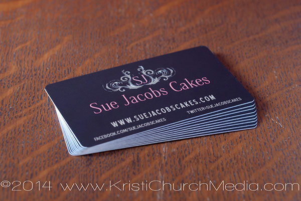
My good friend and client came to me with a troubled heart. She said that at networking groups when she saw her business card get passed around the table it appeared like any other card and blended in with everyone else’s. While it did convey she had a wedding cake business, it was printed on thin stock so it was easily bent and flimsy. It had a design that was out of style by at least 4-5 years and no longer suited her business goals. The fonts on the front of the business card were a telltale sign as they outdated her design.

I went to work creating Sue’s new brand identity and design. I listened to her long-term business goals and what it was that she intended to say to her clients when they reach out and experience her business card. In order to create a classy, timeless business card we performed a case study of her target demographic. She wanted to get to a place where she could reach the affluent bride and be among the top wedding cake designers in Arizona. Creating a brand and business card that was synonymous with her new message put us right on track. Together, we created a design that would speak to her target demographic and that will also stand the test of time for a few long years. She’s thrilled with the results and has had the opportunity to gift her new contacts the super-duper first impression experience time and time again.

These aren’t your papa’s business cards.

The simple rule only applies to the design. Plan to invest a little more in the business cards so you have a nice weighted 14pt or 16pt stock. Going with a heavier stock conveys a few unspoken facts about you as a business person. 1. That you’re serious. 2. You understand the value of making a strong first impression and 3. That you will take as good care of them as you will yourself. It sets a precedent as to how you’ll care for their business.

If you’re targeting an affluent client, I advise staying away from a glossy finish and going with a nice silken matte version that holds depth of color well. It’ll speak volumes. Remember, we’re looking to drive an incredible first impression experience here. A cheap flimsy business card on glossy paper will not bring you that result.
close up business cards

Not all printers are created equal.

At Infinite Reach, LLC,  we only use top end print houses for all of our work and the work we provide our clients. We’ve been around the block with the economy printers and the mixed results we receive are just not worth the time and effort for the dollars we’re trying to save. One run we might have perfect color, another run there’s a dimple in the lower half of the business card in different points within the 500 card run. It’s simple. If you are going to go with an economy printer, expect economy results. There is a time and place for every print job, however, if you really want to garner maximum impact and gift that super-duper first impression experience, invest in a good print house that you can rely on to be consistent each and every time.

That’s not to say that not all actual print machines within a print house are created equal either. Even top level printers can have their inconsistencies. Color variations can happen from machine to machine within a print house. They’re not all calibrated equally. If you’re using deep or dark colors for your main business card color you may see slight variations between runs. This is normal. If the colors are seriously out of whack—definitely reorder. They’ll be happy you mentioned the issue as they might not realize the problem.

Give people a reason….

To either really want to keep your business card for them self, or share your card with others. “If you create a beautiful artifact that is kept rather than thrown away, it will live on,” says Prescott Perez-Fox. Prescott was a contributor to Business Insider in 2012 and goes on to say “people will save a great card even after copying the info—they may even give the card to a friend just to experience it.” This is a perfect business referral. They’ve now become a referral partner and want to see you succeed. Nice!

To expand on Perez-Fox’s thoughts, do something that may feel a little archaic and follow up with a hand-written thank-you-for-the-meeting note (very classy move, I might add). Include a few more of your business cards and say something clever like: “I was so happily surprised by the way you responded upon receiving my business card when we first met. I thought I would send you a few more in case you’d like to pass them on.” This shows you believe that your new contact is influential and that’s just good business juju.

So in summary, creating a business card that will pop isn’t rocket science. Keep the design simple while staying true to your brand and message. Less is more. Stick to matte finish, a nice thick card stock and find a great print house that you can rely on. That’ll make all the difference in the world. As for different sizes and shapes—that’s the cherry added to an already delicious sundae. Start with the basics and go from there and you’ll be gifting that super-duper first impression experience yourself in no time!

Are there any other great points I’m missing? Join the conversation!

Till next time,

Kristi