Creating Images for Your Social Media
I wish I had that instinct knack for creating images and designing graphics to use for our clients or for our own company’s social media purposes.
Our Infinite Reach graphic designers are truly amazing! Anytime I ask for a graphic to be created or a client even needs a new cover photo for Facebook, I am always in awe with the end product.
As Andy Warhol said, “I never read I just look at pictures” and I’m sure many of us can agree with that statement. There’s no doubt that images are an extremely important aspect of social media marketing. They help to drive greater online engagement and keep users interested. To me, a picture says 1,000 words!
For the Non-Designers…
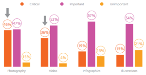
46% of marketers say photography is critical to their current marketing and storytelling strategies. Both video and infographics have become powerful tools for companies looking to communicate easily with their readers. So, if you’re looking to add some spice to your next social media post, then add some images.
So you want to create eye-catching images. Do you want to engage with your viewers? It can be difficult, but there are some key principles in learning how to create images to use for social that work every time.
Create a Balanced Layout
You want the picture to be simple and balanced. The layout of the objects in your images can make all the difference in the way the final photo turns out. The image below is super easy on the eyes. If the pencils were scattered and the books were all over the place, the photo wouldn’t be as great to look at.
Proximity in Your Images
Something else that’s important when creating your own designed images is the proximity and the alignment. Merriam-Webster defines proximity as “the state of being near.” So in our case, grouping different elements of a picture together so that the viewer can see various parts of the message you are trying to convey.
For example, you don’t want an icon too close to the text of a picture in very close proximity because you want each component of the picture to stand apart and fulfill its own role. Take a look at the ad below. The icon visually communicates details about the brand itself, while the text communicates what this particular chapstick brand does for your lips.
Color
Leslie Cabarga is the author of The Designer’s Guide to Colour Combinations. She believes that color is not just a visual element, but it’s also emotional. She says that:
“A poor choice of colors affects us subconsciously is a fact observed by many real estate agents. Potential buyers viewing a house with ugly wallpaper will often reject the whole house. I recall as a child not being able to eat in a certain restaurant whose walls were painted a pale, 1950s green.”
If color really does elicit emotions in us all, then you can see why it’s so important to choose colors for your images that will draw people in.
Make sure you think about the role the colors will play in your creations! You want to also make sure that you’re creating contrast.
Font
Are you creating a graphic that has wording on it? Be sure to choose fonts that are not only readable and consistent, but also fonts that communicate a message about your brand and your company.
Think of choosing a font like selecting an outfit to wear. The clothes that you choose reflect who you are as a person and also parts of your personality and style. If you walk into an interview for a new job wearing a t-shirt and jeans rather than a suit, you will leave the employer with a very different impression of you.
How to Select Fonts for Your Graphics:
- Simple is always better.
- Try and steer clear from fancy fonts.
- Be consistent by using the same font repeatedly for all of your graphics.
So…
Take notes, non-designers! If you’re feeling brave enough to create your own image, I would love to see some photos in the comments. Also, let me know what resources have helped you nail down some great designs!


