Posts

Graphic Design Infinite Reach Communicating Visually

The Ins and Outs of Graphic Design & Communicating Visually

Graphic design is everywhere around you! It delivers messages on everything from what cereal to buy at the store to what the discount or promo code is for a certain week. From street signs to billboards to the logos on your t-shirts to the packaging of that online order you purchased, graphic design is a way to quickly communicate an idea using visuals.

Words, photos, illustrations and text are just a few examples of how graphic design is displayed on things we see on the daily.  Graphic design is a way to tell a story in a matter of seconds with only a few words, or simply an exciting/eye drawing image.

Layout

A page full of words is still an example of graphic design. Think of a magazine article – there is a variety of ways the words can be organized on the page. You can divide them into columns or bubbles, you can stagger certain words and place images in between paragraphs, add a header to the page – the possibilities are seemingly endless. The page layout depends on the message and the audience, but it is nonetheless graphic design in some way.

Typeface

The text you decide to use alone communicates an idea. Compare Times New Roman to any other font. Times New Roman is commonly found in newspapers and academic journals/articles, typically to communicate formality, importance, or professionalism. Since this is historically how this specific font has always been used, when you see this particular font you take the information that’s written with it seriously. Not many designers would use this text to design a poster because it’s not visually stimulating enough or appropriate. Each font you consider when designing something needs to be appropriate for the particular audience you’re targeting the image to.

Images and Words

Graphic designers often use photos and illustrations along with words because it’s an effective way to convey something quickly. Imagine you’re driving and see a billboard advertisement with a picture of a juicy steak that says “Hungry?” right underneath. Go ahead and compare that to a billboard with only words saying, “Eat a juicy steak if you’re hungry.” Which do you think is more effective?

Logos

One of the fastest ways to communicate something is with a symbol, such as a logo. Most companies/brands will use color and imagery to reflect their values. As a company or organization develops, their specific logo slowly yet surely becomes a part of them  – synonymous with their reputation. Logos are a symbol of trust and ownership of a product.

When you see a little white apple, you most likely associate that with Apple, the multinational technology company. When you see that huge yellow and red ‘M,’ you think of McDonald’s. The logo instantly communicates the value and safety of that certain product. The second you see a certain logo, you immediately decide if you trust that brand and want to use those products.

So, Graphic Design…

So, what exactly is graphic design? I hope this blog post summed it up for you! It’s a fast and effective method to communicate visually with a certain audience. Every logo, text, layout and image screams a message. When designed well, your audience will immediately understand its quick coding system. The world would be a much more difficult place to decipher without  graphic design.

Do your marketing materials need a refresh? Lucky for you, now through November 30th, Infinite Reach is offering 15% off all graphic design projects!  Including flyers, social media graphics, business cards, sales sheets, posters, brochures and more! Contact us today!

Your Quick Guide to the Adobe Creative Suite, Infinite Reach Agency

Your Quick Guide to the Adobe Creative Suite

As a small business owner you tend to have to become a jack of all trades, especially when you first start out.  That means doing your own billing, accounting, hiring and even marketing.  With marketing comes the need for ads, websites and collateral, all of which require you to dig into the Adobe Creative Suite.  These are the programs that professional graphic designers use and they aren’t always easy to navigate, but once you get past that you need to know which program is going to be right for the job.

This quick guide will give you some basic information on which programs you will need for each of your graphic design needs.

Adobe Photoshop

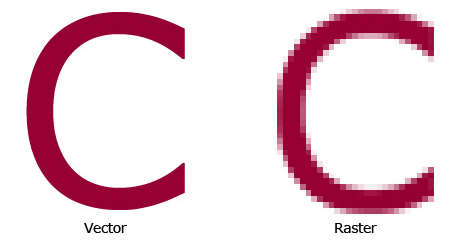
Out of all of the products in the Adobe Creative Suite, Photoshop is probably the most well-known.  This program is raster based, meaning the images are made up of tiny squares called pixels. This makes Photoshop ideal for editing photos.  Our photography team often uses Photoshop in conjunction with another Adobe program called Lightroom.  This program acts more as an “image management program” and allows you to organize photos and place them into categories.  There are some photo editing capabilities within this program, but they are limited compared to Photoshop, that’s why we use the programs together.

Your Quick Guide to the Adobe Creative Suite, Infinite Reach Agency,  Raster Vs. Vector Image

Photoshop is also good for creating digital ads, designing mock-ups of projects like websites or even smaller tasks like resizing or cropping an image.  It’s also used for more complex designs like heavy photo editing or image manipulation for an advertisement.

As I mentioned before, Photoshop is a widely known product, but that doesn’t mean it’s the only program you’re going to need to create all of your marketing collateral.

Adobe Illustrator

Your Quick Guide to the Adobe Creative Suite, Infinite Reach Agency, Illustrator

I consulted with one of the graphic designers on our team, and she said this is her go-to application when working on projects because of how easy the program makes changing image sizes and also moving graphics around.

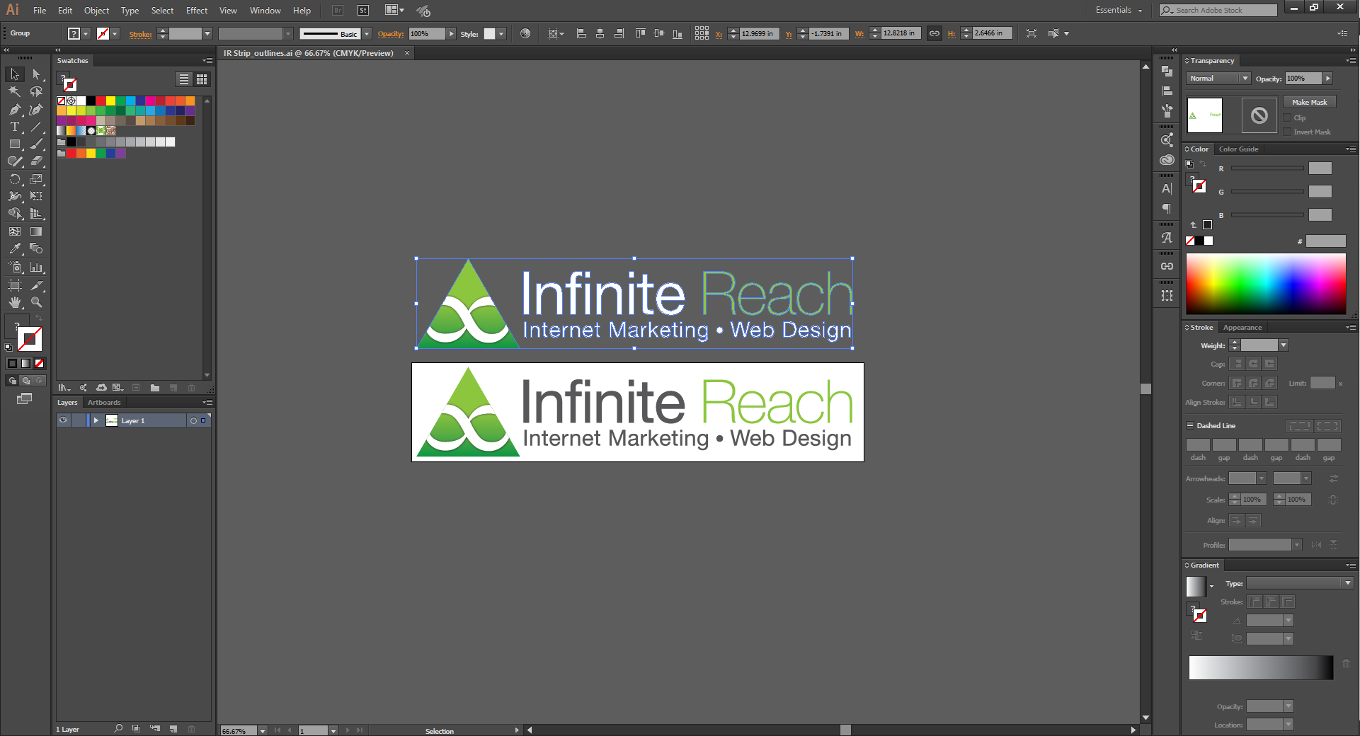
Illustrator unlike Photoshop is vector based which means that when you zoom into the image it will stay smooth with no pixilation like a raster image.  That means when you need to create your logo, this is going to be the application you want to use.  Other common graphics will be icons, charts, infographics, and packaging design.

Vector images and Illustrator in general tend to also be more forgiving if you need to go back and make any changes.  It will also provide a high resolution which is going to be ideal especially when you are creating a logo.

Adobe InDesign

Your Quick Guide to the Adobe Creative Suite, Infinite Reach Agency,  InDesign

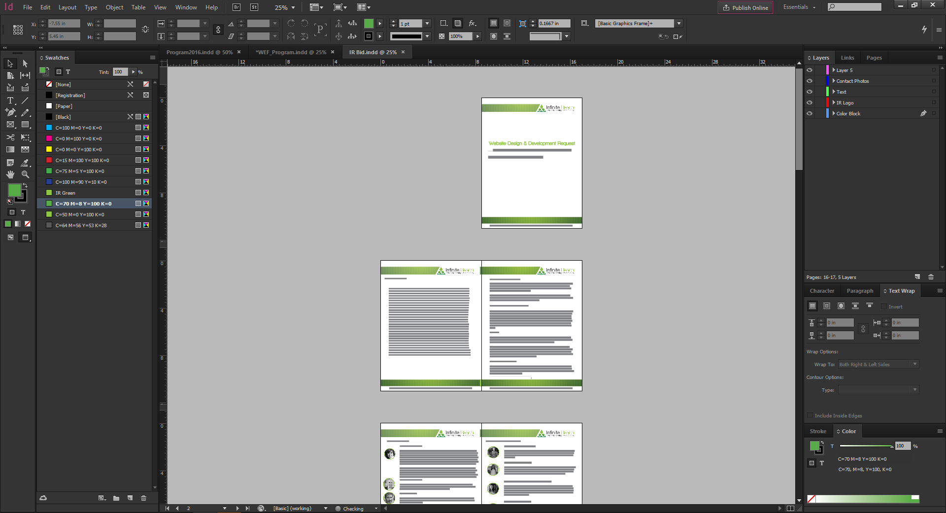
The InDesign application was designed with printed materials in mind and is considered a publishing program.  If you’re trying to create a branded proposal, brochure or booklet, or any project that has multiple pages, you will want to use InDesign.

Unlike the other two programs, InDesign has tools that help with layout rather than graphic creation.  One of these tools is the master page which is good for booklets and document creation.  This allows you to select a master document and apply that template to multiple pages.  The program also allows for multiple master pages, so if only a certain set of pages needs to be the same you can have different master pages to account for that.

In short, InDesign is best for written content and organizing lots of text and also projects like brochures that will eventually go to print.

These are just some of the programs within the Adobe Creative Suite, but they are three of the main programs to get you started on creating marketing collateral for your business.  Another item to remember when creating marketing collateral is brand consistency, check out one of my other blogs to learn more on why that’s so important!

creating images

Creating Images for Your Social Media

I wish I had that instinct knack for creating images and designing graphics to use for our clients or for our own company’s social media purposes.

Our Infinite Reach graphic designers are truly amazing! Anytime I ask for a graphic to be created or a client even needs a new cover photo for Facebook, I am always in awe with the end product.

As Andy Warhol said, “I never read I just look at pictures” and I’m sure many of us can agree with that statement. There’s no doubt that images are an extremely important aspect of social media marketing. They help to drive greater online engagement and keep users interested. To me, a picture says 1,000 words!

images are important

For the Non-Designers…

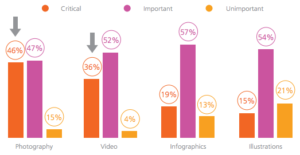
46% of marketers say photography is critical to their current marketing and storytelling strategies. Both video and infographics have become powerful tools for companies looking to communicate easily with their readers. So, if you’re looking to add some spice to your next social media post, then add some images.

So you want to create eye-catching images. Do you want to engage with your viewers? It can be difficult, but there are some key principles in learning how to create images to use for social that work every time.

Create a Balanced Layout

You want the picture to be simple and balanced. The layout of the objects in your images can make all the difference in the way the final photo turns out. The image below is super easy on the eyes. If the pencils were scattered and the books were all over the place, the photo wouldn’t be as great to look at.

balance in images

Proximity in Your Images

Something else that’s important when creating your own designed images is the proximity and the alignment. Merriam-Webster defines proximity as “the state of being near.” So in our case, grouping different elements of a picture together so that the viewer can see various parts of the message you are trying to convey.

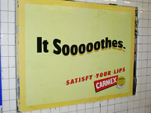
For example, you don’t want an icon too close to the text of a picture in very close proximity because you want each component of the picture to stand apart and fulfill its own role. Take a look at the ad below. The icon visually communicates details about the brand itself, while the text communicates what this particular chapstick brand does for your lips.

proximity in ads and images

Color

Leslie Cabarga is the author of The Designer’s Guide to Colour Combinations. She believes that color is not just a visual element, but it’s also emotional. She says that:

“A poor choice of colors affects us subconsciously is a fact observed by many real estate agents. Potential buyers viewing a house with ugly wallpaper will often reject the whole house. I recall as a child not being able to eat in a certain restaurant whose walls were painted a pale, 1950s green.”

If color really does elicit emotions in us all, then you can see why it’s so important to choose colors for your  images that will draw people in.

Make sure you think about the role the colors will play in your creations! You want to also make sure that you’re creating contrast.

Font

Are you creating a graphic that has wording on it? Be sure to choose fonts that are not only readable and consistent, but also fonts that communicate a message about your brand and your company.

Think of choosing a font like selecting an outfit to wear. The clothes that you choose reflect who you are as a person and also parts of your personality and style. If you walk into an interview for a new job wearing a t-shirt and jeans rather than a suit, you will leave the employer with a very different impression of you.

How to Select Fonts for Your Graphics:

  1. Simple is always better.
  2. Try and steer clear from fancy fonts.
  3. Be consistent by using the same font repeatedly for all of your graphics.

So…

Take notes, non-designers! If you’re feeling brave enough to create your own image, I would love to see some photos in the comments. Also, let me know what resources have helped you nail down some great designs!