Posts

Tips to Make Email Standout

5 Tips to Make Your Email Standout

With the information overload people are faced with every day, it’s no surprise companies need to get a bit more creative for their message to be heard.  On just one of my email accounts I literally have 10,000+ unread emails, and that’s because I just can’t keep up with the amount coming in.  I’m sure most people have a similar inbox, and that just shows how important it is for companies to stand out from the flood of emails their customers are getting every day.  But don’t worry I’ve come up with 5 tips to help make your email campaigns standout!

Who is the email targeted at?

The first step is understanding which audience you are sending your email to. Is this email aimed at potential leads or existing customers?  You need to know who the audience of your email is before you can start creating your email. Understanding the audience helps tailor your messaging to meet their specific needs.  This will help not only the open rate, but will also increase the amount of people who actually click through to items in your email.  If your email is sending to a new list of customers this could also determine whether or not, they unsubscribe from future sends.

Pull them in with a catchy, unique subject line

Don’t be afraid to get creative.  That teaser with just enough information helps drive people to click in and see what you have to talk about. You probably won’t get too many people clicking on an email with a subject like “September Newsletter,” but if you jazz that up a bit to “The 5 SEO Tips you need to know about” that prompts more engagement from your audience. Remember, your subject line is the first thing your audience sees when they scroll through their inbox, so you want something that’s unique, creative and pops out at them.

Keep the branding consistent

This may seem like an obvious thing to consider, but it’s important your branding shines through in your email marketing campaigns. Of course the body of your email is going to change based on the messaging, but keep the header and footer consistent.   Keep certain elements the same, so when your customers open the email they immediately recognize your brand.

And of course the email design and layout

This is going to be unique to your brand, and it’s going to be a crucial piece in capturing the attention of your audience and pushing them to engage with your email.  A great visual, even if it’s simple can help draw your customers and audience in better than a page of text.  Make sure to add in some color to help the email pop and also draw attention to important pieces of information you want people to see.

Another important part of the layout and design is which platforms you want people to be able to view your email on.  Some platforms automatically adjust your email to fit the various devices people may be viewing it on, but others don’t. So, you need to test and make sure your email layout fits the device your audience is most likely to view it on.

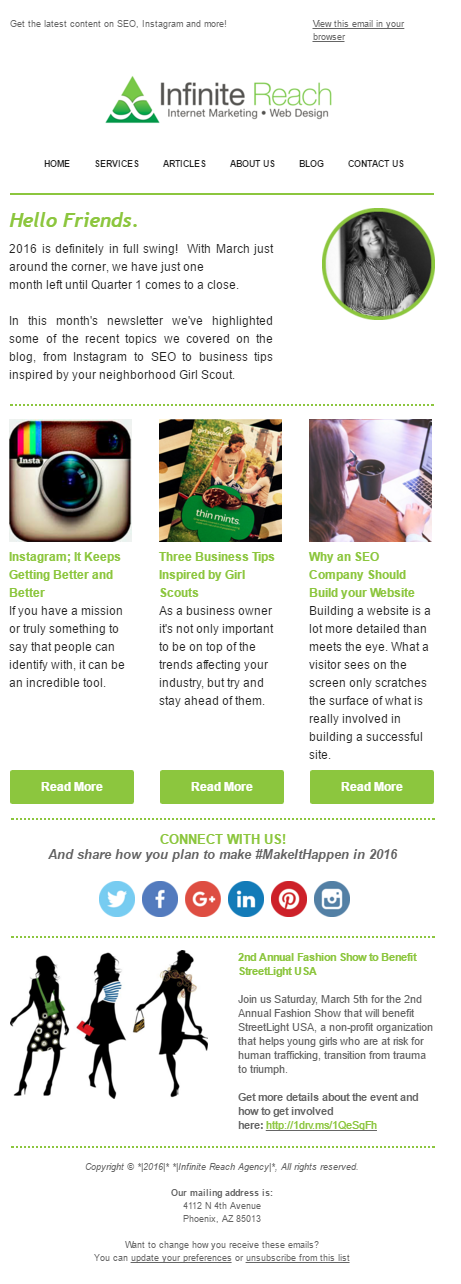
An example of a template we created to send to our monthly subscribers. We change it up each month with new body content, but keep the overall branded layout the same.

Infinite Reach Email Marketing


Don’t be afraid to do some A/B Testing

Testing the performance of your emails is going to help determine what works best for your business.  This is where you fine-tune the process you have for creating and implementing them.  You have tips to get you started, but you still need to find the perfect pairing of all those factors for your business. Most email marketing services offer and option for A/B testing.  So, you can test the open rate of various subject lines, the time sent, or even the actual layout of your messaging.  This will help you determine what your audience really wants.

I hope you enjoy implementing these email marketing tips and feel free to contact our team if you still have some questions!

What Your Branding Colors Communicate to Your Clients

When choosing a color for your branding, it’s important to think carefully. Colors bring along different meanings and feelings to your clients, and it can mean the difference between clients choosing you for their projects or going with your competition.

It seems like a strange consideration. Could color really have that much of an impact?

Facts about the Psychology of Color:

  • 84.7% of consumers cite color as the primary reason they buy a particular product.
  • 80% think that color increases brand recognition
  • Ads created in color are read up to 42% more often than the same ads in black and white.

It Communicates Feelings

It’s no secret that colors are linked to different feelings and emotions. For example, red is regularly considered to be a high-arousal color. Red increases heart rate, encourages appetite and creates a sense of urgency in impulsive decisions. Blue on the other hand is a color associated with peace and a sense of calm. Blue curbs appetite, creates a sense of trust in a brand and increases productivity. It’s worth thinking about the emotion that you want to get across when branding.

This needs to work with your business in conveying the message you want perspective clients to receive.

How do you want your clients to feel when they see your logo or brand? That’s the number one question you need to ask and have an answer to.

Depending on your main color, the response you’ll receive matters. If clients feel sad or angry, are they really going to hire you? They need to feel calm, wanted and appreciated. How about trustworthy, honest and down to earth? All great feelings you want conveyed in your main color.

It Tells Whether you’re Dependable Or Not

When a client hires you, he or she wants to feel like you can be depended on. And before they pull the trigger adding you to their team they’re likely to do a lot of research but in the end it all comes down to that gut instinct and your branding color has everything to do with that. Choosing the right color will help a client decide whether you’re dependable or not.

Some blue shades while bringing sadness can also bring in trust and strength. Those feelings help to lead to the feeling of being dependable. Think about companies like Facebook, WordPress, Oral B and Dell. They all use blue in their logos, and the feeling of dependability and trust are there with the majority of them.

Using It to Show Creativity

Depending on your business, you may want to get across the feeling of being creative and exciting. Choosing the right color is important for this. Purple is an excellent option for getting the idea of creativity through, and this is important for businesses that revolve around writing, photography and graphic design just as examples.

Brands like Syfy, Yahoo and Barbie have used purple for a long time. You can also get the feeling of being regal with this color, which helps to get the feeling of being wise and easier to trust.

Working With a Specific Gender

Another strange element for some is that some branding colors work better for one gender over the other. There are some colors that work for all genders. If you’re a company that predominately works towards one gender, you can show that by choosing the right colors. For example, pinks and purples speak more to females than they do men. Blues and greens work very well when trying to connect more with the men.

If you want to make it clear you favor both genders equally, you really need to consider your color choice. Blacks, silvers, whites and greys are all great for neutral businesses. You can add hints of other colors in there, but you want to keep your branding color as simple as possible to connect with all.

Working With a Specific Gender

In the end, it really does all come down to color for your brand. It’s important to keep your logo simple, but think about the message that you are sending to your prospective clients. If you’re running a party business, the last thing you want is for people to feel sad and lethargic just by looking at your logo. You want them to feel upbeat and excited about working with you.

Quick Color Emotion Guide

Yellows  – Optimism, Clarity and Warmth

Orange – Friendly, Cheerful and Confident

Reds – Excitement, Bold, Appetite Stimulating and Impulsive

Purples – Creative, Imaginative and Wise

Blues – Trust, Loyalty, Peace and Dependability

Greens – Peaceful, Health, Wealth and Growth

Grays – Balance, Calm and Neutral

The color of your brand will give a lot of different messages to people. It will affect how they feel and whether they trust you. Think about that before you pick and stick to a specific color. Decide what message you want to get across and work towards that. If you still need help deciding on the best way to brand your logo and company contact us today!